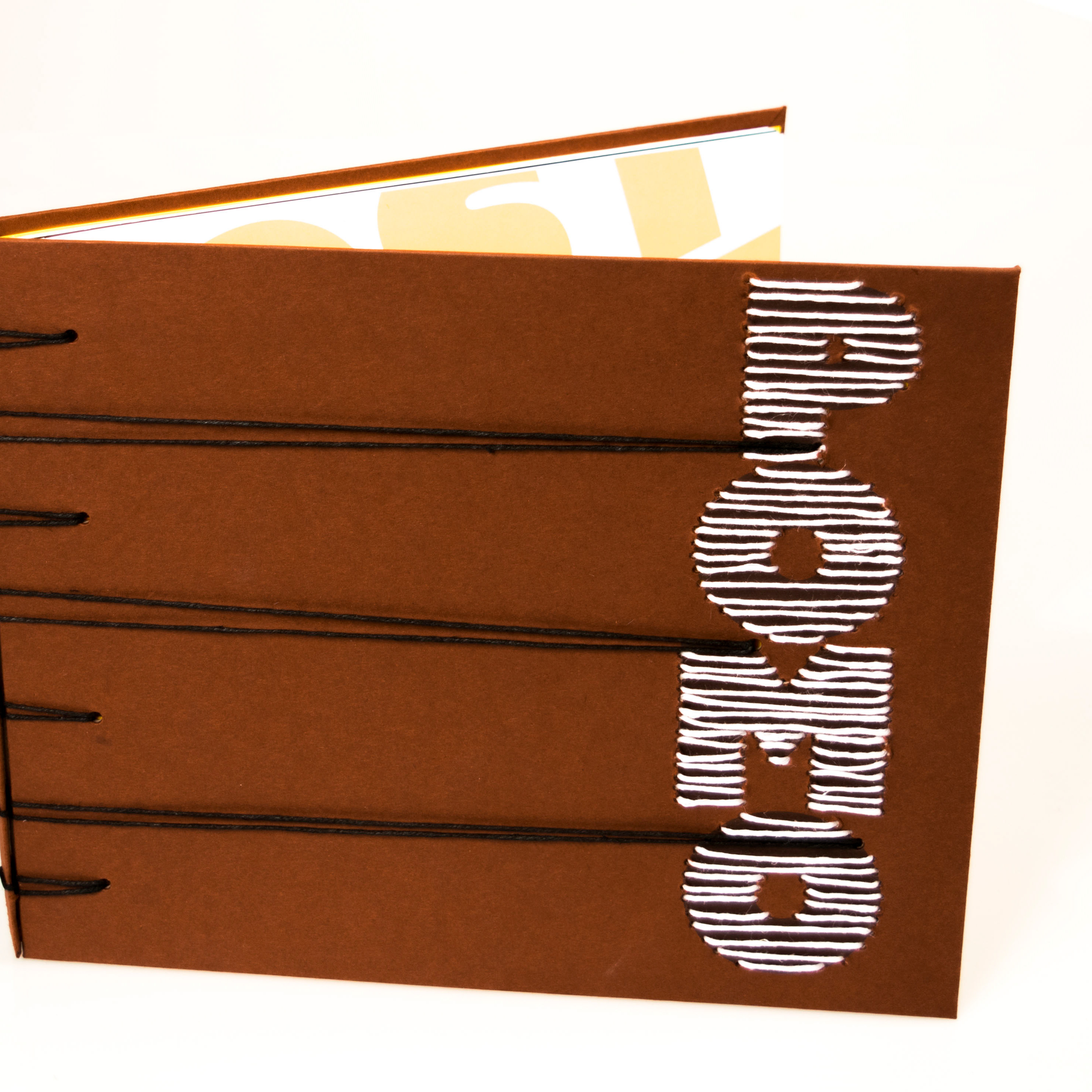
The original idea for the identity branding for Copper Cup Tea Co. was to create a tea that was masculine and would stand out from the soft aspects many teas are branded with, such as florals, light or pastel colors, and traditional type. As the project progressed the tea went more the direction of bold versus masculine with the use of strong colors and an art deco style of illustration. The final product is meant to mimic the bold flavors of the tea and the rich copper color of a good strong brew.


